QDS Usage Dashboard Overview
The QDS Usage Dashboard provides a graphical representation of an account-specific status of commands run and cluster nodes by default in the Status tab by default. The Reports tab can be used to generate reports such as all commands, cluster metrics, and cluster usage. The QDS Status and Reports tab are explained in the following topics:
- QDS Usage Status Dashboard
- Generating Reports using QDS Dashboard
- Getting Data Model Insights and Recommendations
QDS Usage Status Dashboard
The following figure shows a status dashboard overview.
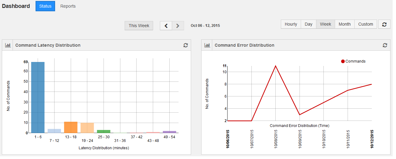
By default it provides weekly status and the status can be viewed by selecting the frequency: Hourly, Day, Month, and Custom. Selecting Custom provides an option to select a date range.
The dashboard provides the following status:
- Command Latency Distribution Status
- Command Error Distribution Status
- Cluster Nodes vs Time Status
- Average Command Latency Status
- Cluster Metrics QCUH Status (AWS)
- Command Status
- Job Instance Status
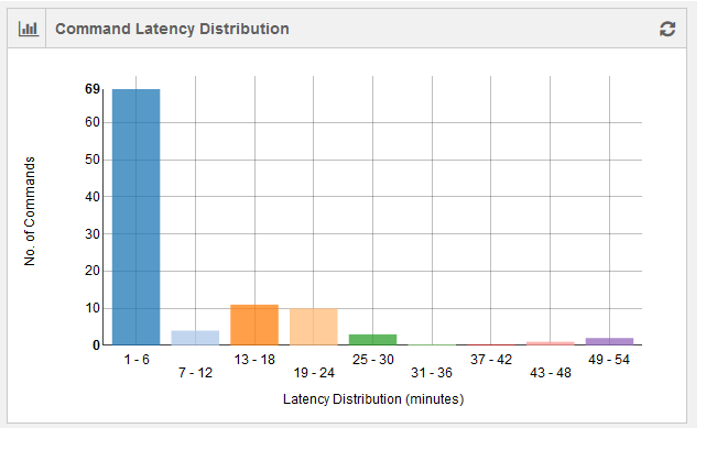
Command Latency Distribution Status
The command latency distribution for an account is shown as a bar graph. The number of latent commands is plotted against time (in minutes). The command duration for a set of commands run at a given time is considered. The difference between maximum and minimum command execution duration is calculated. The latency denominator is calculated by dividing the difference in the minimum and maximum command duration by 10. This graph contains 10 data points.
The following figure shows a weekly status of command latency.
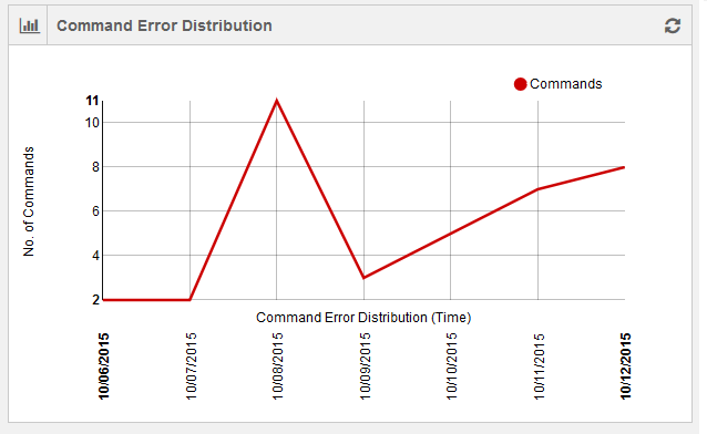
Command Error Distribution Status
The command errors’ distribution is shown as a line chart with number of command errors in an account plotted against time. Time is dynamic and it is in minutes for hourly status and in days for weekly/monthly/custom status. The following figure shows a weekly status of command errors.
Cluster Nodes vs Time Status
This line chart shows the usage of cluster nodes per account against time. Time is dynamic and it is in minutes for hourly status and in days for weekly/monthly/custom status. The following figure shows a grpahical representation of weekly status of cluster nodes against time.
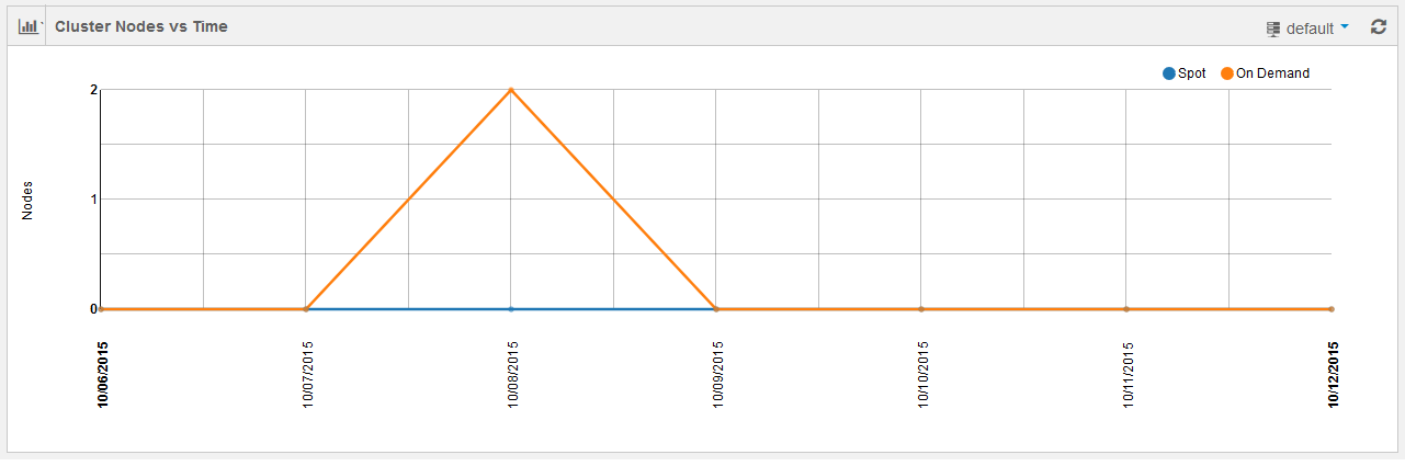
Two different line charts are shown for On-Demand cluster nodes and Spot cluster nodes.
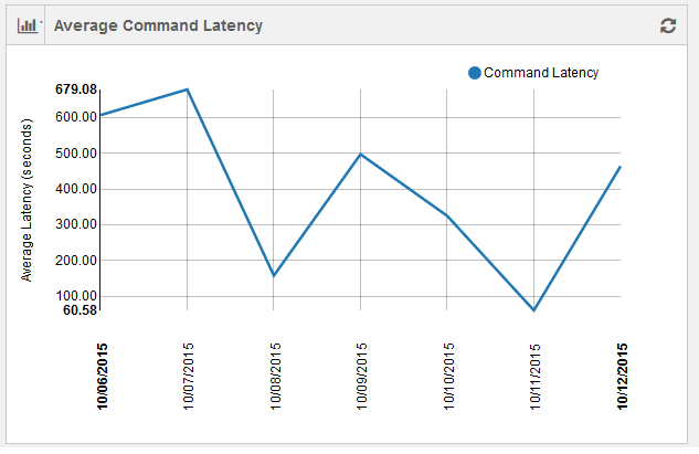
Average Command Latency Status
The average command latency is shown as a line chart with average command latency per account plotted against time. Time is dynamic and it is in minutes for hourly status and in days for weekly/monthly/custom status. The following figure shows a graphical representation of weekly average command latency.
Cluster Metrics QCUH Status (AWS)
For AWS, this is a line chart showing Qubole Compute Unit Hours (QCUH) per account plotted against elapsed time. Time is dynamic and is in minutes for hourly status and in days for weekly/monthly/custom status. However, QCUH numbers in this chart may not match the formal accounting exactly. The following figure shows a grpahical representation of weekly status of QCUH against time.
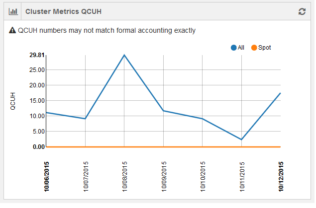
Two separate line charts are shown for spot nodes and all nodes.
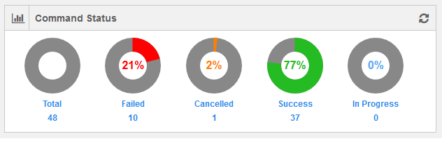
Command Status
This chart gives the number of commands with Failed/Cancelled/Success/In Progress status along with total number of commands in an account as per the selected frequency that is hourly/daily/weekly/monthly.
The following figure shows a weekly data of commands’ status.
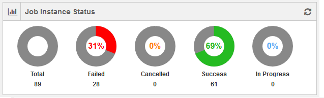
Job Instance Status
This chart gives the number of job instances with Failed/Cancelled/Success/In Progress status along with total number of job instances in an account as per the selected frequency that is hourly/daily/weekly/monthly. The following figure shows a weekly data of job instances’ status.
Generating Reports using QDS Dashboard
In the QDS Usage, the Reports tab is used to generate reports such as cluster metrics and cluster usage. Click the Reports tab and it is displayed as shown in the following figure.
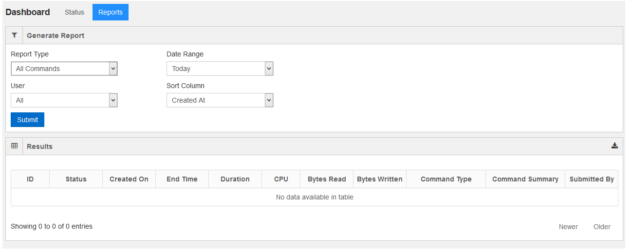
The following filters can be used to generate reports.
- Report Type - This filter is used to select the type of report. By default, it contains All Commands.
The options available in the drop-down list are:
- Canonical Hive
- Cluster Usage
- Cluster Nodes
- User - By default, the drop-down list contains All and the other option in the drop-down list is Current.
- Date Range- This option can be used to select a date range for a report. By default, the drop-down list
contains Today and other options available in the drop-down list are:
- This Week
- Last Week
- This Month
- Custom. Selecting it gives an option to select a date range.
- Sort Column - Use this option to sort the columns in the report. By default, the drop-down list contains
Created At. The other options available in the drop-down list are:
- CPU - The CPU column signifies the cumulative CPU time spent by all cluster nodes in the cluster that processed the command.
- Bytes Read - It denotes the total bytes read by the command.
- Bytes Written - It denotes the total bytes written by the command.
A sample all-commands report is as shown in the following figure.
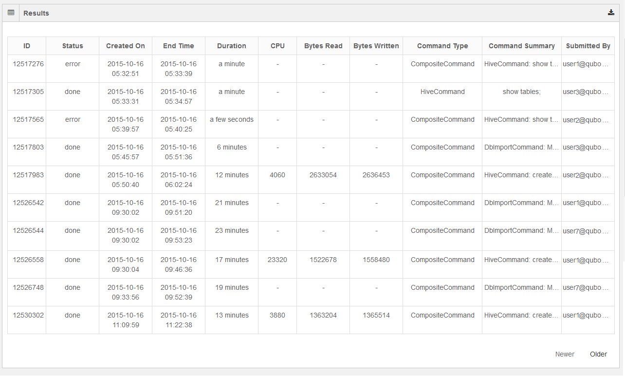
The report displays the most-recent commands are shown in the first page and it contains the Newer button disabled. Click the Older button to see the next set of commands that are older than the recent commands.
Getting Data Model Insights and Recommendations
QDS can examine your data layout and usage and make recommendations that improve productivity and reduce cost. Under their respective tabs, you can get Insights and Recommendations.
Currently this capability is available only for Hive queries.
Data Model Recommendations has these filter recommendations for the last 90 days:
- Type
- Schema
- Tables
- Date (day, week, month)
Insights
By examining successful queries, QDS can provide aggregate insights into how the tables are being used. Reports are refreshed daily.
QDS can report on all tables, or hot tables specifically. Output is is graphs and tables.
All Tables
This view provides the following graphs:
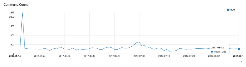
Command Count
The command count for an account is shown as a trend-line chart, with the number of commands plotted against date. Only successful commands are considered, and the total number of commands on any given day (x-axis) is calculated and plotted against the count value in the y-axis.
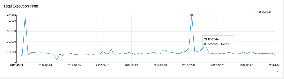
Total Execution Time
Total execution time is shown as a trend-line chart at the account level. The execution time for each query on a given day is aggregated (y-axis) and plotted against date (y-axis). The execution time represents the actual time taken for a query to complete and is not normalized for the amount of resources consumed. So for a query run on a large cluster, the execution time may be less than the execution time when the same query was run on a smaller cluster.
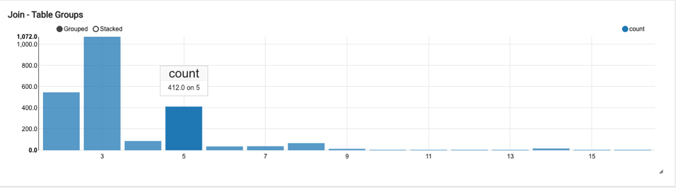
Join-Table Groups
The histogram of the number of tables that are joined together in a query is shown as a bar graph at the account level. The count of the number of tables joined together (x-axis) is plotted against the count of number of queries (y-axis) over the period for which the insight is generated (90 days).
For example, the below chart indicates that in 412 queries, a total of 5 tables were joined together:
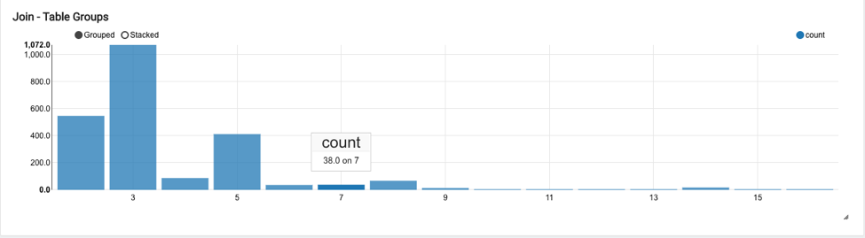
Similarly in 38 queries a total of 7 tables were joined together:
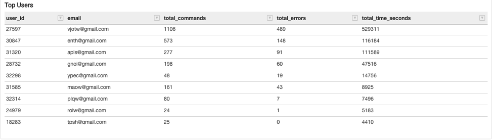
Top Users
The Top Users table shows a leader-board of the top users in terms of query count, with other data such as total commands submitted by each user, total errors, and total execution time (for all the queries submitted by this user) and total CPU seconds. CPU seconds represents the total amount of CPU resources spent on executing the query submitted by the user, serving as a proxy for resource consumption at the user level. The time in the CPU column signifies the cumulative CPU time spent by all cluster nodes in the cluster that processed the command.
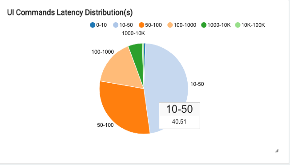
UI Command Latency Distribution
The latency distribution (execution time) of the commands submitted from the QDS UI is shown as a pie chart. This groups the command run-time into different buckets in terms of seconds (0-10, 10-50, 50-100, 100-1000, 1000-10K, 10K-100K). All the queries that were successfully executed are aggregated, and the percentage distribution is shown in the pie chart.
For example, the chart below shows that 40.51% of the overall successful queries in the last 90 days took between 10 and 50 seconds:
Hot Tables
Hot Tables provides aggregate and table-level insights for hot tables. Currently, hot tables are calculated using the total query count. Insights are provided for up to a maximum of 100 hot tables.
Insights for hot tables are available for:
Predicate Column Usage
This chart shows how predicates are used in queries executed on hot tables that are partitioned. The pie chart shows the distribution of queries across three categories:
- Partitioned: Represents the percentage of queries using as a predicate the column on which the target table is based.
- Non-partitioned: Represents the percentage of queries with a predicate column that is not part of the target table’s partition strategy, and so not using the table’s partition.
- No Predicates: Represents the percentage of queries with no predicates, not using the target table’s partition at all.
For example, this pie chart shows that 75.07% of the queries have a partitioned column as a predicate:
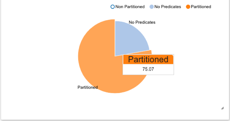
Table Data Format
This is a pie chart showing the percentage of commands using hot tables that are in:
- Columnar format (ORC, Avro, Parquet)
- Non-columnar format
For example, the chart shows that 85% of the queries use hot tables that are in non-columnar format (text); only 15% of the queries using hot tables that are in columnar format (ORC):
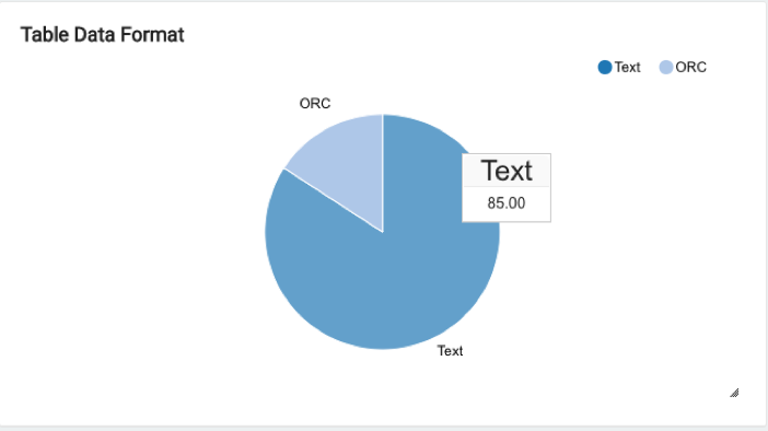
Table Level Predicate Usage
A bar chart showing the individual table’s partition usage in queries that use these tables.
- Partitioned: Represents the percentage of queries with a predicate column matching the column on which the target table is partitioned.
- Non-partitioned: Represents the percentage of queries with a predicate column that is not part of the table’s partition strategy, and so not using the table’s partition.
- No Predicates: Represents the percentage of queries with no predicates, and so not using the table’s partition at all.
Top K Hot Tables and Data Format (K=100)
A table showing the most-used hot tables in ascending order and their data formats, and showing:
table_name: the name of the table.count: the number queries that were run against this table.percent_usage: the usage of this table (in terms of query count) as a percentage of the top 100 hot tables.format_info: the data format of the table.total_time_seconds: the total execution time of all queries that were executed on this table.average_time_seconds: the average time a query spent processing this table.
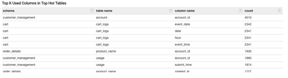
Top K Used Columns (K=4) in Top Hot Tables
A table showing the most-used columns for each hot table in ascending order. K=4, meaning a total of four most-used columns for each of the 100 top hot tables. This shows:
Schema: The schema to which the table belongs.table name: The name of the table.column name: The most-used column name.usage count: The number of queries that contain this column name as part of a filter or predicate.
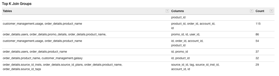
Top K Join Groups (K=100)
This shows a total of 100 join groups (for hot tables) and shows:
- Tables: The hot table names that are frequently used together in joins.
- Columns: The columns in the join clause based on which the table groups are joined.
- Count: The number of queries in which this table group is joined based on the provided join clauses (columns).
Recommendations
Under the Recommendations tab, QDS provides recommendations as follows.
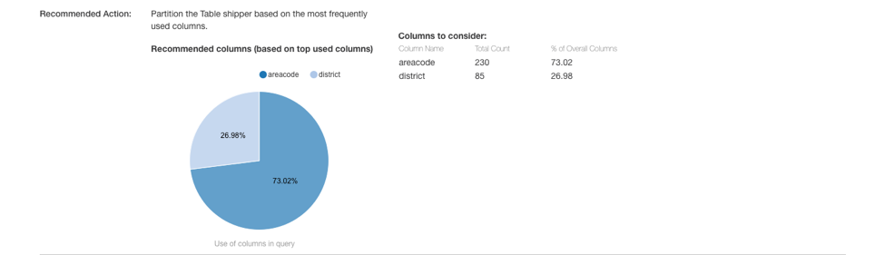
Table Partitioning
QDS checks for tables that have no partitions. If a table is not partitioned, each query must scan the entire set of data, so these tables are prime candidates for partitioning:
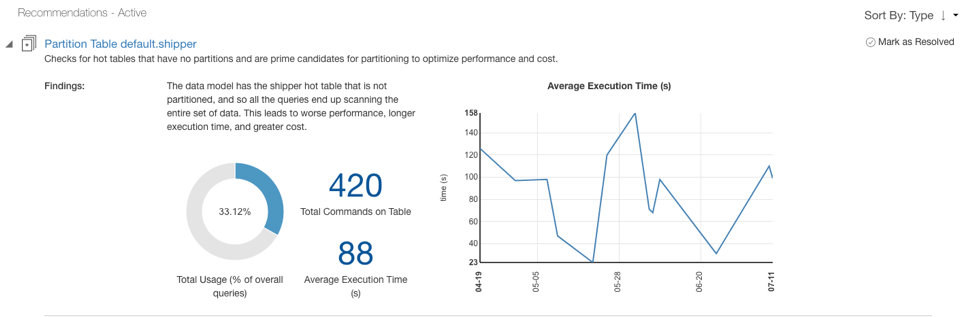
QDS identifies the most used filters and recommends them for partitioning:
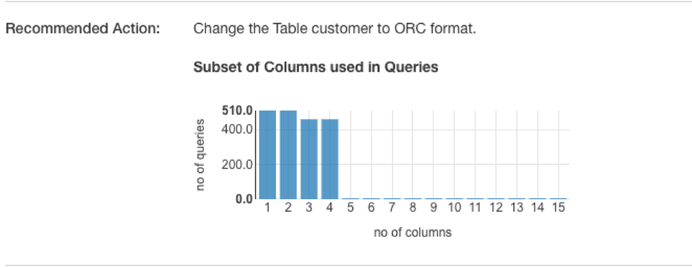
Data Format
QDS checks for tables that are not in columnar format. If a table is not in columnar format, each query must scan the entire set of data, so these tables are prime candidates for converting into columnar format:
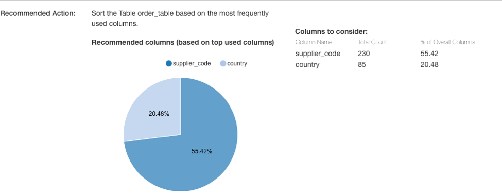
Column Sorting
QDS checks for tables that are not sorted on the columns most frequently used in filters, so each query must scan the entire set of data:
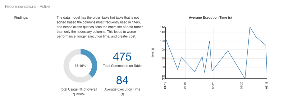
These tables are prime candidates for sorting:
How QDS decides between partitioning and sorting recommendations
QDS considers column cardinality in deciding whether to make a partitioning or sorting recommendation for the most-used columns: if the column cardinality is high, QDS makes a sorting recommendation; if the column cardinality is low, QDS makes a partitioning recommendation.