Test with a sample use case
Visualization of cost per employee
The dataset for this use case is stored in BLOB storage in Azure (Home > Storage accounts > canopydata> defloc). Tables are created and made readily available to users on their default database. More information on the tables is found in the Tables tab.
Launch Power BI. At the top left corner on the home tab, click Get Data.
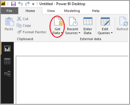
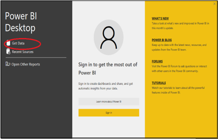
Alternately, you can select the Get Data option from the dialogue window that appears when you start Power BI.
In the Get Data dialog, select Qubole Connector.
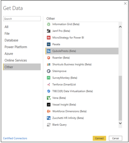
Click Connect to open the Qubole Connector dialog.
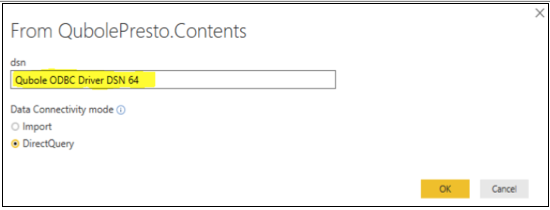
Enter the DSN (Data Source Name), which is available in ODBC configuration. For example: Qubole ODBC Driver DSN 64.
In Data Connectivity Mode field, select the DirectQuery radio button and click OK.
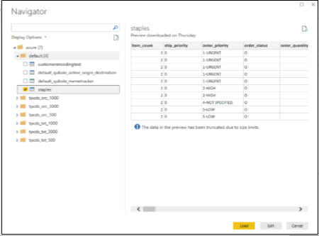
Click the folder name to connect to the required database. On successful connection, tables within the database are listed. Click the desired tables to have preview of the sample data.
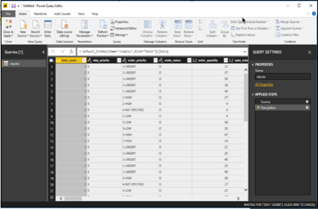
Click Edit. This initiates a query to extract required data sets from the data source. Transform the raw data by filtering, sorting, and cleaning.
Example
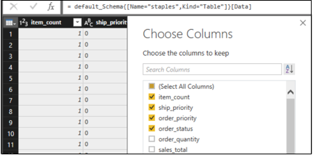
Suppose the user is only interested in selected columns from the table. Data can be transformed using options provided on the table icon below the formula bar in the left corner. Click Table Icon followed by Choose Columns. Tick the required columns. A query that filters the required columns will be initiated and the data will be refreshed.
After the transformation is done, the desired data is ready for visualization. Close the Edit window, and save for further analysis.
Tables are listed in the right pane in the FIELDS section. Select the fields listed under the table for visualization. Here, employee_name and employee_salary are selected in the Staples table.
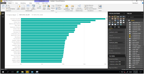
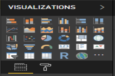
Select the desired visualization, for example bar chart, column, or pie chart, by selecting the options shown below:
You have now successfully created your first Power BI visualization with direct connection to Qubole services.
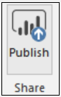
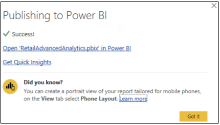
You can publish the visualization created to Power BI app to be shared with others. Click Publish in the top panel.
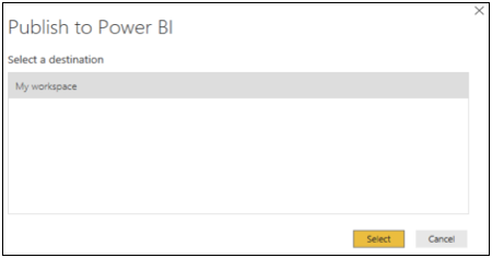
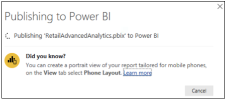
If you are not signed in, you will be prompted to sign in. Once you sign in, select the destination workspace. Publishing will happen in the following way:
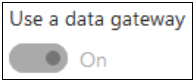
Before proceeding to view the dashboard created on Power BI app, make sure that you have installed an on premise or enterprise gateway. You can find the details here: Power BI.
Configure the gateway for the Qubole Connector.
Once the gateway is installed, sign in with your Microsoft credentials. Navigate to the Connectors section, as shown below, and provide the path where the mez file is placed. (Make sure this location is accessible to everyone on the system.)
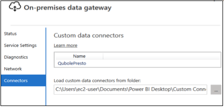
The QubolePresto connector name will appear as shown in the image above.
Click the Open “<Dashboardname.pbix> in Power BI” link. This will take you to Power BI app.
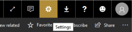
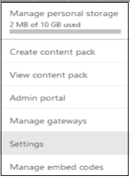
Once you are on Power BI app, click Settings in the top right hand corner:
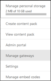
Click Manage gateways.
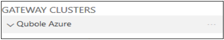
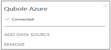
Click … beside the Qubole Azure Gateway and click ADD DATA SOURCE.
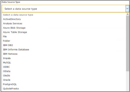
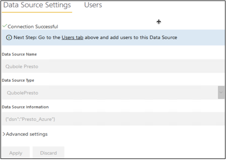
Fill in the data source name and select QubolePresto from the list of data source types:
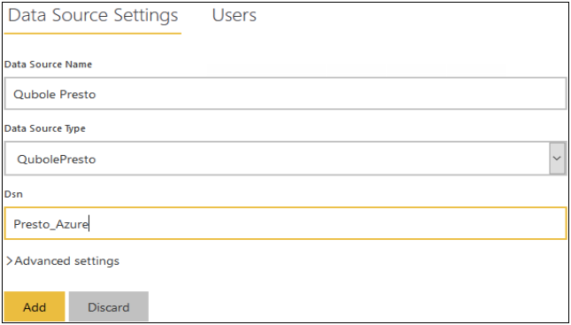
Fill in the DSN. This DSN name should match the DSN with which you created the Visualization. Click Add.
Click Settings in the top right corner, and click Settings in the list displayed:
Click Datasets, and select the datasets you uploaded from Power BI.

Make sure the gateway you added is associated with the dataset.
You can experience and share the visualization on Power BI app.