Using Plotly
Plotly is a data visualization library, which you can use to create graphs and dashboards.
Perform the following steps to generate plotly visuals:
Navigate to the Notebooks page.
Enter the plotly code in the paragraph and click the Run button.
Note
If the language of the notebook is not pyspark, then you must use
%pysparkas the first line in each paragraph.The following example shows a sample code.
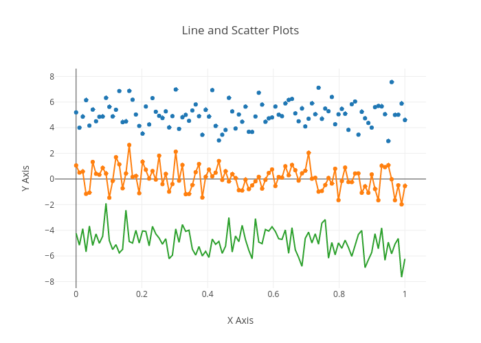
import plotly
import plotly.graph_objs as go

# Create random data with numpy
import numpy as np

def plot(plot_dic, height=1000, width=1000, **kwargs):
    kwargs['output_type'] = 'div'
    plot_str = plotly.offline.plot(plot_dic, **kwargs)
    print('%%angular <div style="height: %ipx; width: %spx"> %s </div>' % (height, width, plot_str))


N = 100
random_x = np.linspace(0, 1, N)
random_y0 = np.random.randn(N)+5
random_y1 = np.random.randn(N)
random_y2 = np.random.randn(N)-5


trace0 = go.Scatter(
    x = random_x,
    y = random_y0,
    mode = 'markers',
    name = 'markers'
)
trace1 = go.Scatter(
    x = random_x,
    y = random_y1,
    mode = 'lines+markers',
    name = 'lines+markers'
)
trace2 = go.Scatter(
    x = random_x,
    y = random_y2,
    mode = 'lines',
    name = 'lines'
)


layout = dict(
  title = 'Line and Scatter Plots',
  xaxis = dict(title='X Axis'),
  yaxis = dict(title='Y Axis'),
  showlegend = False,
  height = 800
)

data1 = [trace0, trace1, trace2]
fig1 = dict( data=data1, layout=layout )
plot(fig1,  show_link=True)
The respective interactive graph is displayed in the Notebooks page as shown below.