Visualising Using Python Plotting Libraries
You can visualize Python on the Spark driver by using the display(<dataframe-name>) function.
The following Python libraries are supported:
plotly
matplotlib
seaborn
altair
pygal
leather
Note
The display() function is supported only on PySpark kernels.
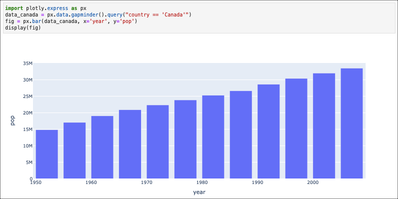
Using plotly
import plotly.express as px
data_canada = px.data.gapminder().query("country == 'Canada'")
fig = px.bar(data_canada, x='year', y='pop')
display(fig)
The following image shows the visualization of the plotly plot.
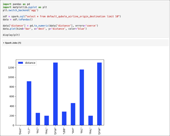
Using matplotlib
import pandas as pd
import matplotlib.pyplot as plt
plt.switch_backend('agg')


sdf = spark.sql("select * from default_qubole_airline_origin_destination limit 10")
data = sdf.toPandas()

data['distance'] = pd.to_numeric(data['distance'], errors='coerce')
data.plot(kind='bar', x='dest', y='distance', color='blue')

display(plt)
The following image shows the visualization of the matplotlib plot.
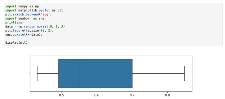
Using seaborn
import numpy as np
import matplotlib.pyplot as plt
plt.switch_backend('agg')
import seaborn as sns
print(sns)
data = np.random.normal(0, 1, 3)
plt.figure(figsize=(9, 2))
sns.boxplot(x=data);

display(plt)
The following image shows the visualization of the seaborn plot.
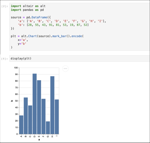
Using altair
import altair as alt
import pandas as pd

source = pd.DataFrame({
    'a': ['A', 'B', 'C', 'D', 'E', 'F', 'G', 'H', 'I'],
    'b': [28, 55, 43, 91, 81, 53, 19, 87, 52]
})

plt = alt.Chart(source).mark_bar().encode(
    x='a',
    y='b'
)
The following image shows the visualization of the altair plot.
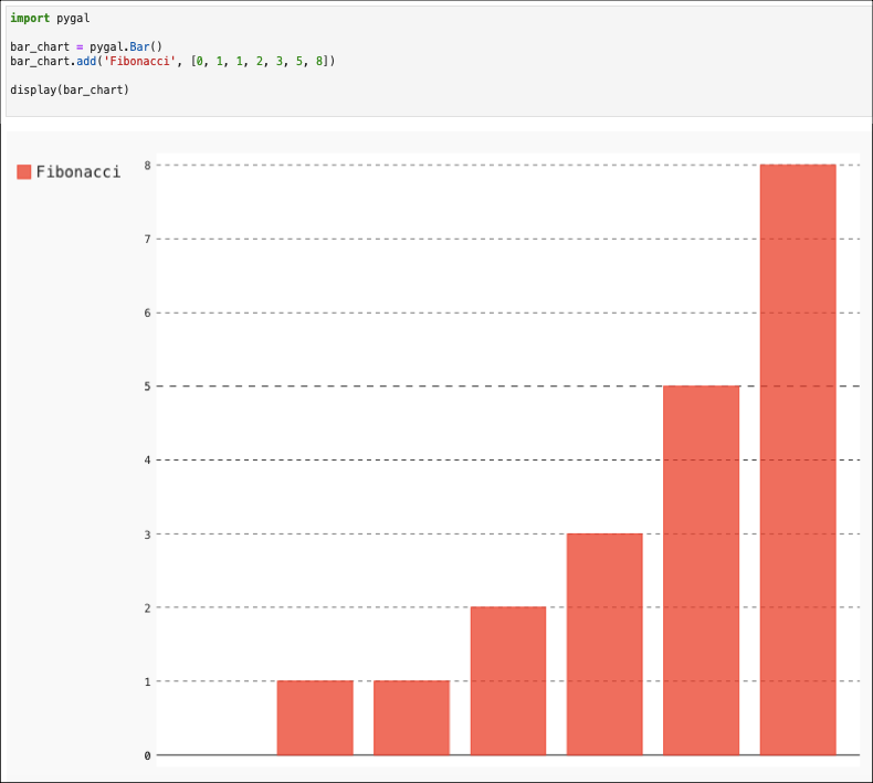
Using pygal
import pygal

bar_chart = pygal.Bar()
bar_chart.add('Fibonacci', [0, 1, 1, 2, 3, 5, 8])

display(bar_chart)
The following image shows the visualization of the pygal plot.
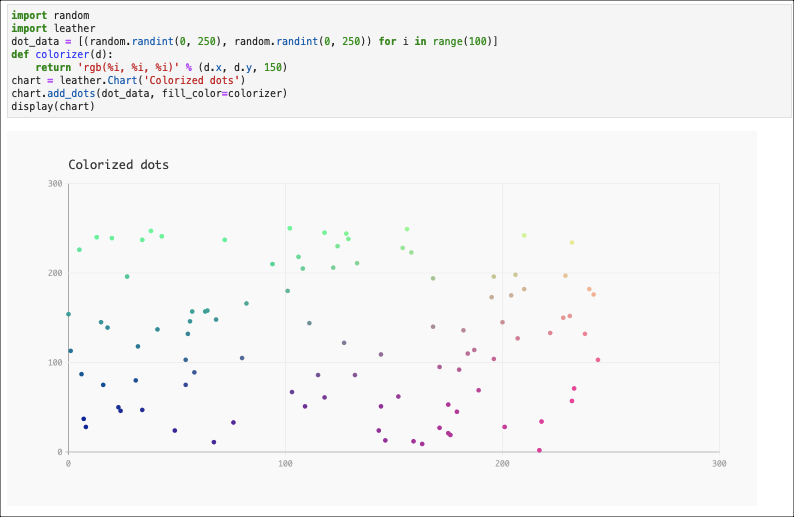
Using leather
import random
import leather
dot_data = [(random.randint(0, 250), random.randint(0, 250)) for i in range(100)]
def colorizer(d):
    return 'rgb(%i, %i, %i)' % (d.x, d.y, 150)
chart = leather.Chart('Colorized dots')
chart.add_dots(dot_data, fill_color=colorizer)
display(chart)
The following image shows the visualization of the leather plot.
For other plot types, refer to the PlotExamplesPySpark.ipynb in the Example Notebooks of the Jupyter notebooks.